Love of Blue
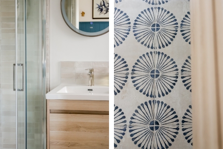
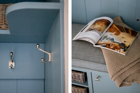
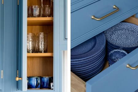
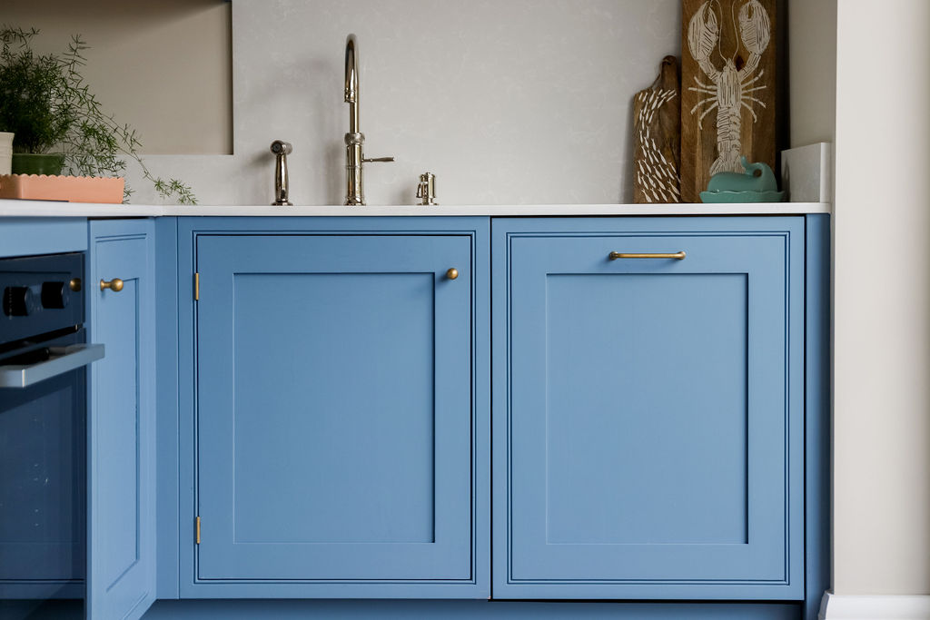
A favourite colour can be a wonderful starting point - but it needs careful handling to feel calm, considered and liveable.At this Salcombe townhouse, blue became the thread that connects the whole home. It appears in the kitchen cabinetry, wall panelling, tiles, fabrics and smaller details.
The brief was not simply to use blue throughout, but to make it feel natural to the house and the setting. With the estuary close by, the colour already felt connected to the view - our role was simply to find every thoughtful and beautiful way to honour it.
Tone, not colour
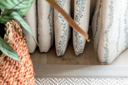
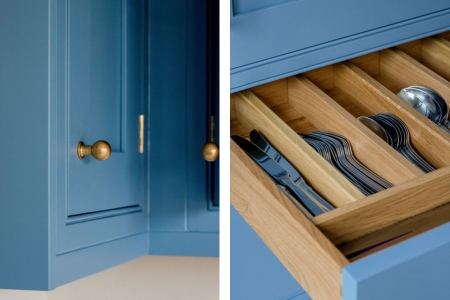
Blue is an expansive family. The discipline lies in how it is handled - knowing when to deepen, when to soften, and how it shifts across surfaces: gloss tile, matte paint, woven fabric, painted timber.
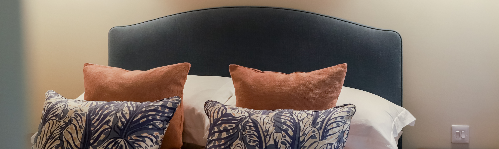
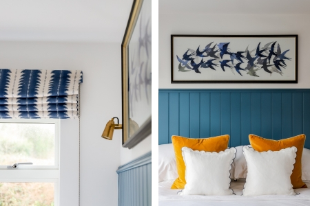
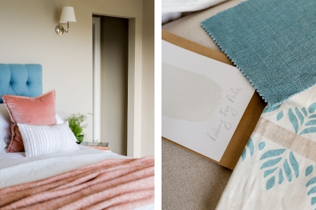
Each room asked for its own interpretation. In the kitchen, the tone sits somewhere between sky and sea. In the bedroom, it deepens - almost midnight - grounding, cocooning, restorative. It is always the same instinct, simply expressed in different ways.
.jpg)
What a single colour teaches you
Designing a home around one colour is as much about restraint as it is about creativity. Blue forms the thread, but never the whole story. Warmth is carried by brass, linen, timber - materials that soften and balance.
The colour unifies, but only because everything else is allowed space to breathe.
At this Salcombe townhouse, it works because it was never imposed. It was simply the only choice.
Want to learn more about the structural transformation?